Toohey Reid
Website Design | Visual Story Telling | Brand Tone Refinement
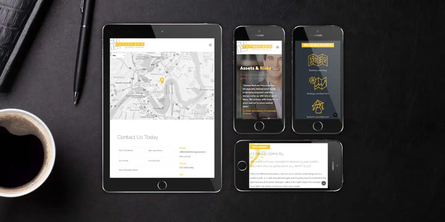
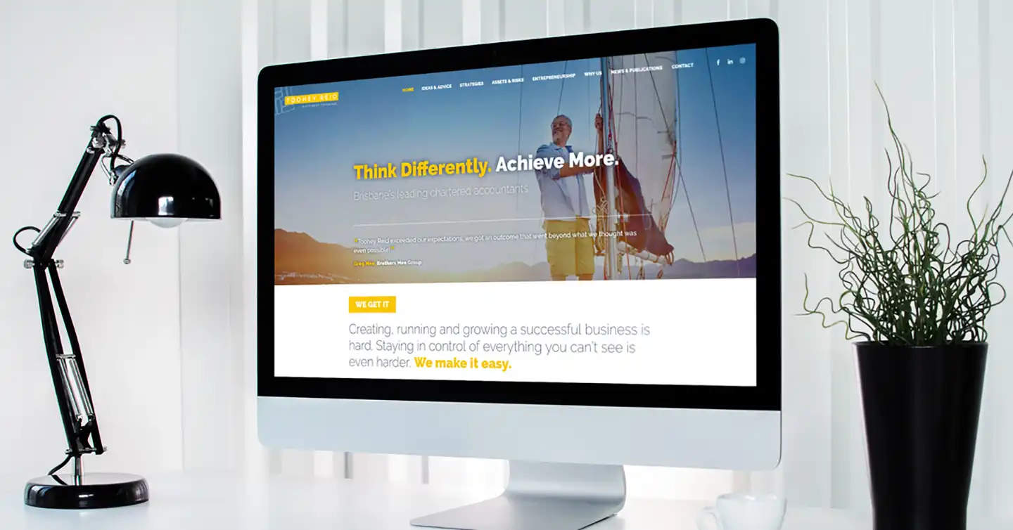
Attractive Website Redesign
Improved Website Readability
Standout Graphic Designs
Different Thinking
That’s the accounting firm’s motto. However, their old stock-standard website did not communicate this at all. Toohey Reid wanted to stand out from their competition, so they enlisted the help of Ronin Marketing for digital marketing and website design solutions.
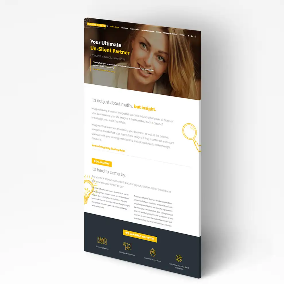
Using the ‘different thinking’ as a starting point, we strategically restructured and rewrote their website content around a creative solutions-based approach, rather than a standard services-based format. The website is geared towards the lifestyle advantages you can expect with Toohey Reid, rather than an explanatory essay on accounting services.


Crafting Creativity
To illustrate their point of difference in their creative solutions-based approach, we used sketched graphics throughout the site to visually suggest creativity and to provide a stark contrast to typical accounting firms.
To keep the balance between creative and professional, the rest of the style is slick, light, and modern. We used lots of white space and light typography to give a sense of buoyancy and life, combined with aspirational photography to complete their makeover.

