Point Accounting
Logo Design | Corporate Branding
Minimalist Branding
Contemporary Graphic Design
Print Design
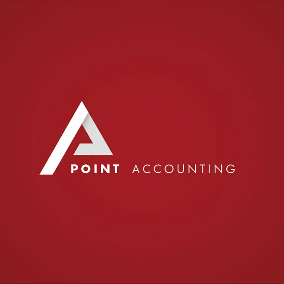
Point Accounting wanted a striking and contemporary rebrand focused on their company’s values of forming strong, honest relationships. To stand out from their competition and suggest strength we decided on a bold red colour scheme, and to suggest their precision, a highly geometric approach was taken.
The logo mark was based on a geometric rendering of the P and A, adding a sense of direction and dynamism to the brand.


